
Mobile Friendly Animated Backgrounds for Websites in 2026
Compare mobile friendly animated backgrounds for websites across CSS, SVG, canvas, and WebGL options, with performance trade-offs and setup tips.

Your hero looks smooth on a desktop monitor. Open the same page on a phone, though, and the waves judder while you scroll, the brightest blob passes behind the headline, and the signup button stops feeling responsive. The animation hasn't changed, but its available space and rendering budget have.
Choosing mobile friendly animated backgrounds for websites means looking beyond the preview. You need to know whether an effect uses CSS, SVG, canvas, WebGL, or exported media, and what happens when the visitor requests less motion. A mobile optimization claim is useful, but it isn't a substitute for testing the background inside your actual layout.
Mobile deserves that attention. Mobile devices accounted for 64.35% of global website traffic in July 2025, according to StatCounter GlobalStats as reported by Quantumrun.
A background earns its place when the page still feels fast, the text stays readable, and the static version still looks intentional.
The options below suit different jobs, from quiet blog headers to interactive portfolio heroes. The recommendations distinguish documented features from safeguards you'll need to implement yourself. Start with the page type you're building, then choose the least demanding effect that gives it the right character.
1. Animated Backgrounds
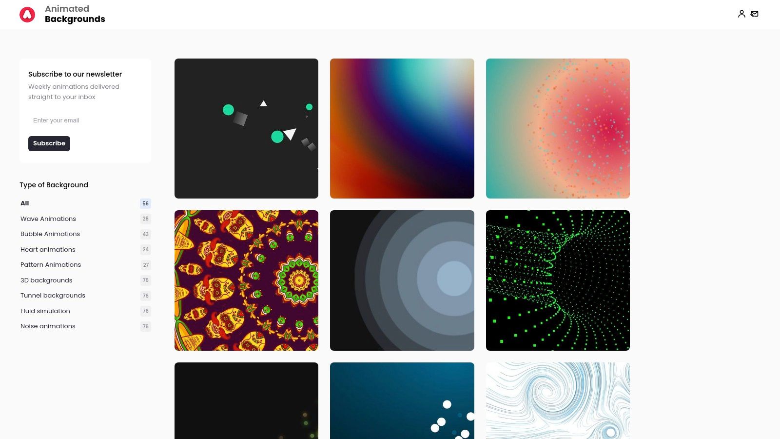
Best for landing pages, blogs, and presentation-style pages that need reusable HTML and CSS. Animated Backgrounds offers categorized starting points rather than requiring you to build an effect from scratch. The collection includes waves, bubbles, hearts, patterns, dimensional effects, tunnels, fluids, and noise.
That variety is useful during design exploration. A restrained pattern might support a content-heavy header, while waves can give a short campaign page more movement without introducing a separate animation engine. Adjustable colors and styles let you carry the same brand palette into different page templates.
Choose the effect, then inspect the code
The site describes its backgrounds as optimized for mobile, but that shouldn't be read as a guarantee for every integration. Inspect the selected snippet for animated properties, element count, overflow, and positioning. HTML and CSS can be straightforward to reuse, but a continuously repainted effect still needs testing.
- Setup: Add the supplied markup and styles, then scope them to your background container so they don't affect other components.
- Mobile fit: Prefer restrained waves or patterns behind text, and simplify more elaborate effects for narrow layouts.
- Motion handling: Verify reduced-motion behavior yourself. Automatic fallback coverage isn't established across the collection.
- Trade-off: No-code builders need custom-code support, and published pricing details aren't specified in the available product information.
Keep the decorative layer separate from your content and prevent it from intercepting taps. The Animated Backgrounds blog provides a companion resource when exploring animation choices. I'd shortlist this library when editable code and visual variety matter more than a highly interactive scene.
2. Vayro
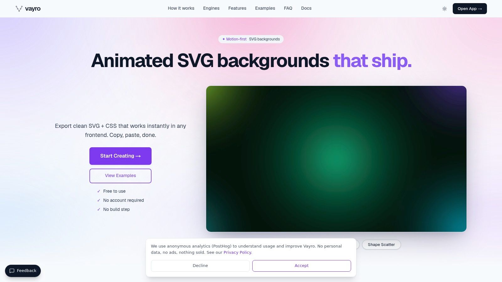
For a product signup page with a soft abstract backdrop, Vayro is a focused option. It generates animated SVG, with controls for palettes, speed, layers, and composition, then exports either embedded animation or separate SVG and CSS. You don't need a separate JavaScript animation runtime.
Its narrower selection is a strength if you want waves, blobs, mesh gradients, or scattered shapes rather than themed scenes. You can adjust the composition before export instead of repeatedly editing unfamiliar code. The browser-based workflow also avoids an account requirement.
A useful accessibility head start
Vayro includes a reduced-motion guard in exported animations. That's more concrete than a general mobile-friendly label, although you should still inspect the resulting static appearance. The MDN documentation for prefers-reduced-motion explains how the media feature responds to the visitor's motion preference.
SVG scales cleanly, but scaling isn't the same as cheap rendering. Complex filters, overlapping shapes, and large animated regions still deserve a performance check.
The trade-off: You get editable vector output and relatively little setup, but less stylistic breadth than a large background catalog. For mobile layouts, check the SVG's crop and alignment behind your actual headline. A beautifully balanced desktop composition can put its busiest region directly behind stacked text on a phone.
3. Vanta.js
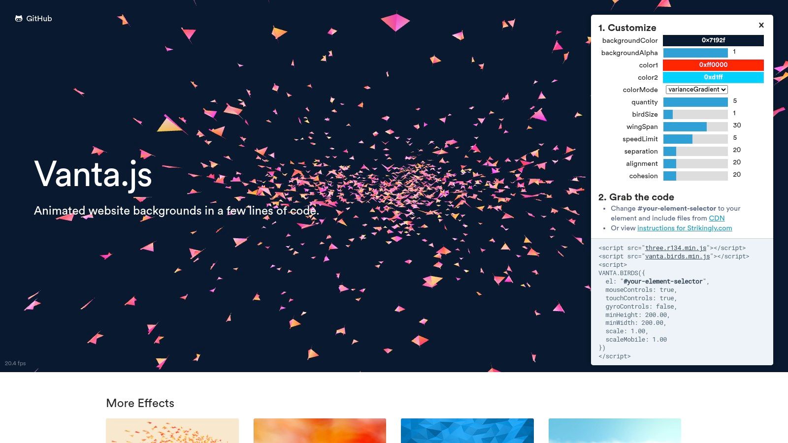
Vanta.js is better suited to a distinctive desktop hero than a default mobile background. Its dimensional waves, birds, fog, clouds, cells, and rings can give a portfolio or creative studio homepage a recognizable visual identity. Some effects also respond to pointer or touch input.
The Vanta.js website warns that some effects don't work on mobile devices. Take that warning seriously: visual richness isn't evidence that the same scene belongs behind a mobile lead form.
- Technology: JavaScript-driven effects using WebGL and canvas-related rendering approaches, with dependencies varying by effect.
- Setup: Load the appropriate dependencies, initialize the effect against a container, and clean it up when that container unmounts.
- Mobile strategy: Provide a static background and only enable the live scene where it performs acceptably.
- Reduced motion: Treat preference detection and conditional initialization as integration work rather than assuming universal coverage.
Don't initialize an expensive effect and then merely hide its canvas with CSS. Skip creation when motion is disabled, and destroy the instance when the page no longer needs it.
Choose Vanta.js because the dimensional effect matters to the design, not because an empty hero needs filling.
For a text-heavy service page, CSS or SVG is usually the more proportionate starting point. For an art-directed portfolio opening, Vanta.js can justify the extra engineering.
4. tsParticles
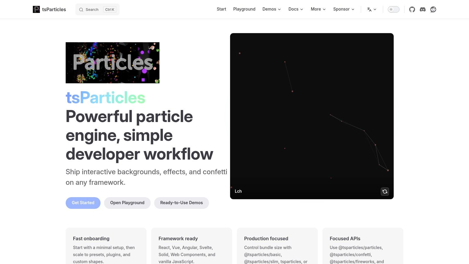
A developer building a star field, seasonal snowfall, or connected-node backdrop needs control over behavior, not just color. tsParticles provides that control through a canvas-based particle engine, presets, interactive demos, and integrations for frameworks including React, Vue, Angular, and Svelte.
Its flexibility is also its main implementation cost. Particle count, movement, interactions, shapes, and high-DPI rendering all need deliberate choices. A preset is a starting configuration, not a mobile performance certificate.
Tune the drawing workload
For a mobile campaign page, begin with sparse particles and no interaction. Add connected lines, hover responses, or denser movement only after checking scrolling and input responsiveness. High-DPI settings deserve particular attention because rendering sharpness comes with additional drawing work.
The cross-device animation workloads discussed in this mobile web performance paper reinforce the need to choose rendering technology for scene complexity and test constrained device conditions. Canvas is useful for many independently moving objects, but it doesn't remove the cost of updating them.
Best fit: Developer-owned landing pages, event pages, and interactive experiences where particle behavior contributes to the concept. Poor fit: A no-code page without custom-script support, or a blog that only needs a little ambient movement.
Implement reduced-motion behavior, off-screen pausing, and route-change cleanup explicitly. I'd choose tsParticles over a copied particle snippet when the project needs maintainable configuration and framework integration.
5. MotionCanvas CSS
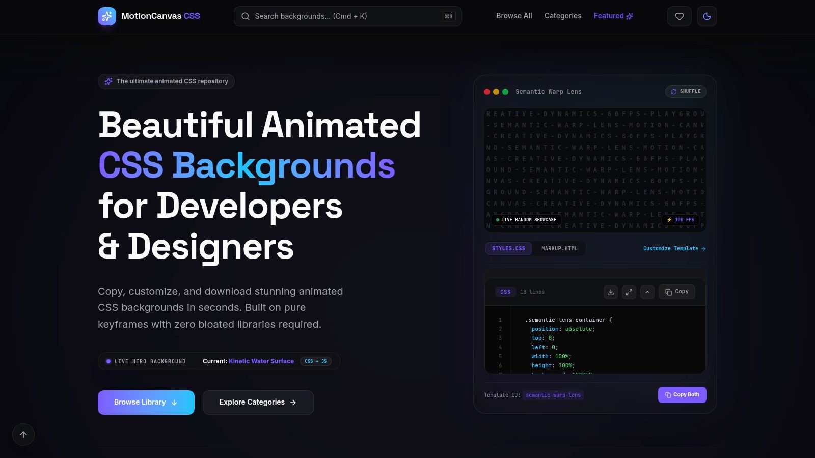
Despite its name, MotionCanvas CSS isn't restricted to CSS. Its collection includes CSS, canvas, and WebGL backgrounds, with categories, implementation labels, performance-related filters, and a customization playground. That makes it useful when you're comparing approaches before committing to one.
For a marketing team exploring visual directions, the technology labels are more useful than a gallery of unexplained previews. You can shortlist a quiet CSS gradient separately from an interactive scene, then estimate the integration work accordingly.
- Best page type: Marketing landing pages where developers need several visual candidates to compare.
- Setup: Copy the selected markup and styles, then account for any scripts or dependencies required by that particular effect.
- Mobile caution: Provider performance scores aren't independent benchmarks for your visitors' devices.
- Accessibility: Check reduced-motion behavior per effect rather than assuming the whole catalog shares one implementation.
The important distinction is what the animation changes, not whether its listing says CSS. Moving a layer with transform differs from repeatedly repainting a large filtered surface. Read the code before accepting a lightweight label.
Use the simpler entries for mobile-first layouts. Save elaborate WebGL and interactive scenes for bounded hero sections with a static alternative. Also check the individual effect's access requirements and terms before making it part of a reusable client template.
6. LandingPagePrompts Animated Backgrounds
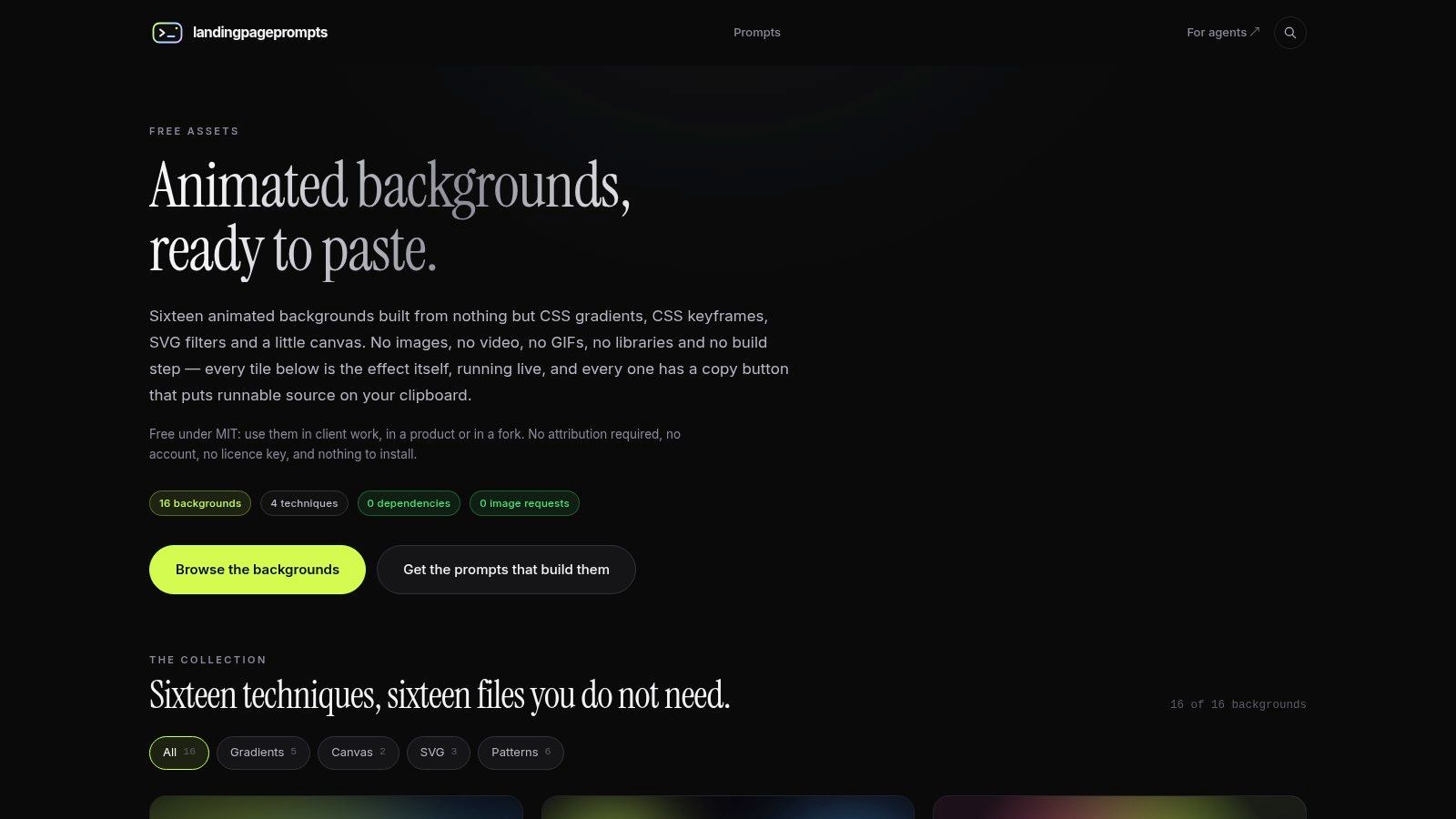
Self-contained snippets are often the right answer for a small launch page. LandingPagePrompts Animated Backgrounds combines copyable HTML and CSS with effects built from gradients, keyframes, SVG filters, and small canvas scripts. The collection is described as dependency-free and MIT-licensed.
The practical advantage is ownership of a small implementation. You can place the background inside an existing hero component without adopting a broader animation library. That's useful for a product announcement, waitlist page, or temporary campaign.
Implementation guidance matters here
The collection includes guidance for reduced motion and pausing off-screen animation. Those details matter more than whether a preview runs smoothly while it fills your browser window. Once the visitor scrolls to pricing or a form, the hero background shouldn't keep doing unnecessary work.
You'll still need to position the decorative layer, manage clipping, and keep the content above it. SVG filters and canvas scripts deserve separate testing because dependency-free doesn't mean rendering-free.
For related implementation reading, the production articles on the Animated Backgrounds blog offer another place to explore production concerns.
The trade-off: This is a smaller, code-oriented collection rather than a broad visual editor. Choose it when you want a snippet you can understand and maintain. Don't choose a canvas effect because it's packaged beside simpler CSS options; assess each implementation on its own.
7. Tileio
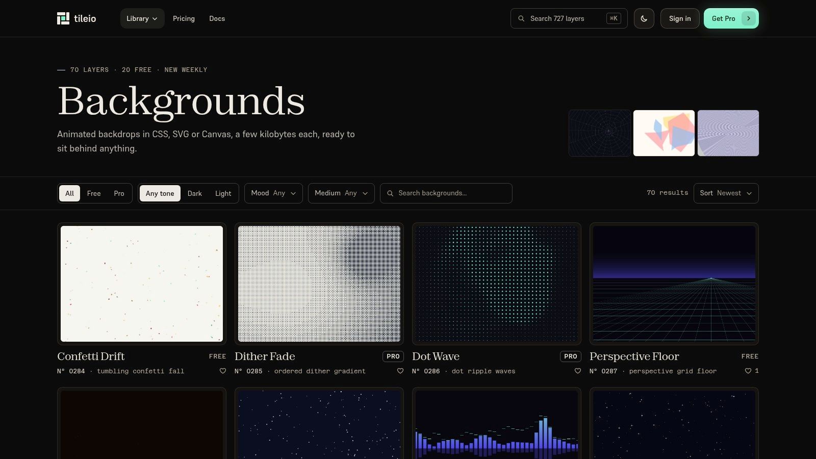
Tileio suits designers who know the atmosphere they want but haven't settled on the implementation. Its background catalog spans CSS, SVG, and canvas, with options such as perspective grids, ripples, fog, confetti, and animated patterns. Previewing those approaches together helps narrow the design direction.
For a developer portfolio, a perspective grid might support the visual identity. For a resource library or documentation homepage, a restrained pattern is more appropriate. The right choice depends on how much reading happens over the animation.
- Code flexibility: Editable backgrounds can adapt more readily than a fixed video composition, provided you're comfortable changing the implementation.
- Access requirements: The catalog mixes free and Pro entries, so check the selected asset's terms before committing.
- Mobile behavior: Rendering demands vary by item, even when the effects look similarly subtle.
- Motion support: Verify the chosen snippet's fallback behavior; don't assume catalog-wide reduced-motion handling.
Tileio is best treated as a source of candidate implementations, not a uniform runtime with identical behavior across every asset. Inspect whether the code uses a small decorative layer or a larger animated scene.
Setup effort therefore ranges from adapting styles to integrating a canvas loop. For mobile-first content pages, shortlist the simplest patterns first. Keep fog, dense confetti, or elaborate dimensional effects for places where their visual contribution justifies the extra testing.
8. Mosso Animated Backgrounds
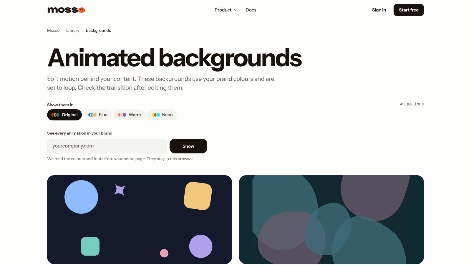
A marketing team may need the same branded motion on a website, in a presentation, and in a campaign video. Mosso Animated Backgrounds fits that workflow with editable looping designs and export options including Lottie, GIF, MP4, and transparent video.
That makes it different from a CSS snippet library. You edit shapes, colors, and timing, then choose an output format and its corresponding playback method. The eventual browser workload depends on that export and how you embed it.
Match the export to the destination
For a website, compare the animation's download cost, playback behavior, and fallback appearance before selecting a format. A Lottie export needs a compatible player, while video needs appropriate playback attributes and a poster image. GIF is convenient to embed, but gives you less direct playback control than a video element.
Mosso provides guidance on contrast, display coverage, and off-screen pausing. You still need to implement those choices in the page, including stopping or replacing playback for reduced-motion users.
Production decision: Exported media makes visual approval predictable, but it doesn't make delivery and playback free.
Best fit: Brand-led campaign pages and teams reusing motion across channels. Trade-offs: Free library downloads require an account, third-party elements may carry separate licensing terms, and media exports introduce asset-management work.
For a mobile blog header, a quiet CSS background is usually easier to maintain. For a coordinated campaign identity, Mosso's editing and export workflow can be more useful.
9. Plasmanica
Plasmanica specializes in plasma and mesh-gradient backgrounds rather than offering every category of animation. It provides color and motion controls, live embeds for HTML, Webflow, and Framer, plus video and image exports. That focused workflow suits product pages with an established abstract-gradient art direction.
The key decision is whether to embed the live effect or publish an exported asset. Live embeds use WebGL, so the convenience of a no-code integration shouldn't be mistaken for a low rendering cost.
- Live embed: Useful when continuous, adjustable motion is central to the design, but requires device testing and fallback planning.
- Video export: Offers a fixed visual result, with download and playback costs to manage.
- Static image: A sensible mobile or reduced-motion alternative when the palette matters more than movement.
- Setup: Approachable for Webflow and Framer users, though lifecycle and accessibility behavior still need checking.
The site states that commercial use is allowed without attribution. Confirm the current terms for the asset you choose, especially when incorporating it into a reusable client deliverable.
I'd use Plasmanica for a tightly contained product hero, not automatically across an entire scrolling page. Keep the gradient's brightest regions away from body copy, and verify how the composition crops on narrow screens. If the phone experience loses little when motion stops, ship the static version there.
10. Wensity Background Studio
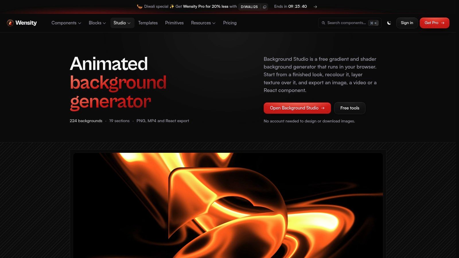
Wensity Background Studio suits teams that need an editor rather than a code snippet. Wensity's browser-based studio offers gradient, shader, and texture starting points, along with recoloring, layered editing, and image, video, and React export options. That makes it useful when a marketing hero needs several rounds of art-direction changes.
The browser editor's responsiveness does not show how an exported effect will perform on a mid-range phone. Judge the deployed version separately. A live shader uses more rendering work than a static image or simple CSS background, so it may suit a desktop hero better than a mobile layout where the motion adds little.
Decide the delivery format early
React export fits a React-based project and requires a package. Some export options may be limited to paid plans, so check the studio's current access terms before building an approval process around a particular export. Setup depends on the chosen output: a static image is straightforward to place, while a live shader or React effect needs implementation and device testing.
For a SaaS marketing page, use the studio to settle the palette and texture, then compare a live version with a static alternative. If motion barely changes the impression, avoid adding a runtime dependency just to preserve it. Keep editable originals with the deployment assets, and document which version is intended for mobile.
The handoff matters when a design is revised later. How animation studios store archives between productions offers a useful reference for keeping working files organized alongside final assets.
Mobile recommendation: Check reduced-motion behavior in the exported implementation and specify a fallback. Wensity is strongest for visual exploration; the selected output determines the setup and rendering cost on phones.
Mobile-relevant attributes of animated background tools
The right comparison is how each option renders, what mobile behavior is documented, and how much setup it demands. The available descriptions do not specify reduced-motion support or rendering cost for these tools, so treat both as unconfirmed rather than assuming a phone-ready result.
| Item | Rendering method | Mobile behavior and setup | Best for |
|---|---|---|---|
| Animated Backgrounds | HTML and CSS code | Described as optimized for mobile; add backgrounds with a few lines of code and adjust colors and styles | Designers seeking a broad, adjustable background library |
| Vayro | Animated SVG with optional separate CSS | Mobile behavior and setup details not specified | Scalable abstract backgrounds with simple exports |
| Vanta.js | JavaScript, WebGL, and canvas effects | Mobile behavior and setup details not specified; dimensional effects may suit desktop hero sections better than a phone layout | Interactive, dimensional hero backgrounds |
| tsParticles | Open-source JavaScript particle engine | Mobile behavior and setup details not specified; configurable particle effects need implementation in a project | Developers needing configurable particle effects |
| MotionCanvas CSS | CSS, canvas, and WebGL | Mobile behavior and setup details vary by effect; inspect the rendering method before choosing | Browsing and adapting varied background effects |
| LandingPagePrompts | CSS snippets | Mobile behavior varies by snippet; MIT-licensed examples are available to adapt | Developers wanting self-contained background snippets |
| Tileio | CSS, SVG, and canvas | Mobile behavior varies by item; check the selected implementation | Browsing a varied code-based background catalog |
| Mosso | Lottie, GIF, MP4, and transparent video | Export formats differ in how they run on a phone; choose the format to suit the page | Branded animations for websites and presentations |
| Plasmanica | WebGL gradients, with video and image exports | Mobile behavior depends on using a live effect or an exported asset | Custom plasma and mesh gradients for web or no-code projects |
| Wensity Background Studio | Gradient, shader, and texture editor | Mobile behavior depends on the export; some exports require Pro | Teams customizing and exporting a wide range of backgrounds |
Animated Backgrounds is the only entry here explicitly described as mobile-optimized. For the others, rendering method identifies what to inspect, not proof of performance or reduced-motion handling. A CSS or SVG snippet may need less setup than a JavaScript or WebGL effect, while exported video or images shift the choice from live rendering to a prepared asset.
Pick the Lightest Background That Still Does the Job
Start with CSS or SVG when they meet the design goal, then move to canvas or WebGL when the visual result justifies the additional work. A soft wave behind a newsletter signup doesn't need the same rendering approach as an interactive star field. No-code embeds also need scrutiny, because easy installation says little about what runs inside the browser.
For code-based effects, prefer movement built around transform and opacity, and inspect animations that continuously change layout or repaint large areas. The HTTP Archive Web Almanac performance chapter reports non-composited animations on approximately 40% of mobile pages. The practical lesson is to inspect the implementation, not trust the animation's apparent simplicity.
Test the page, not just the preview
Use a real mid-range phone with the full page loaded, including navigation, analytics, forms, and other scripts. In Chrome DevTools Performance, compare the page with animation enabled and disabled, then inspect rendering activity and interaction responsiveness. Scroll through the hero, open the menu, type into the form, and change orientation.
- Protect readability: Check every stage of the loop behind headings, labels, and buttons, not just the opening frame.
- Respect motion preferences: Enable the operating system's reduced-motion setting and confirm that the page presents a deliberate static alternative.
- Stop invisible work: Pause the animation when its container leaves the viewport and when the document becomes hidden.
- Handle cleanup: Cancel animation loops, disconnect observers, and destroy library instances when components unmount.
Battery behavior deserves the same attention as initial loading. MDN's CSS performance guidance recommends considering an option to disable animation for mobile or low-powered devices with limited battery capacity. A small stylesheet can still drive continuous rendering, so file size alone isn't a useful measure of ongoing cost.
For most content-led pages, I'd shortlist Animated Backgrounds, Vayro, or a restrained self-contained snippet first. Choose tsParticles when particle control matters, and reserve Vanta.js or live shader tools for designs that need their dimensional effects. Media-oriented tools make more sense when the same approved animation must travel across web, presentation, and video workflows.
The final test is simple: does the background improve the page without making its main task harder? If visitors can read, scroll, and act comfortably with motion enabled or disabled, you've made a defensible choice. If not, simplify the effect before adding more optimization code.
Animated Backgrounds offers categorized HTML and CSS animations with adjustable colors and styles for websites, blogs, and presentations. Visit Animated Backgrounds to choose a starting point, adapt it to your layout, and test its motion and static fallback on your target phones before publishing.