
8 Animated Background Ideas for Landing Pages in 2026
Explore 8 animated background ideas for landing pages, from CSS waves to WebGL fluids, plus tips for matching each style to your brand and mobile users.
Your SaaS team has a sharp headline, a clean product shot, and a button that should be obvious. Yet the hero still feels flat next to competitors, and swapping in a stock photo or another plain gradient doesn't fix it. Dropping in a heavy animation won't fix it either if visitors have to find the call to action through swirling color.
That's the essential choice with animated background ideas for landing pages. You need motion that matches the brand, leaves text readable at every moment, and still runs smoothly on a mid-range phone. That last test isn't optional. Google reports that 53% of mobile visits are abandoned when a page takes longer than 3 seconds to load.
The eight styles below run from lightweight CSS and SVG effects to GPU-heavy WebGL scenes. Each one gets the same three checks, brand fit, content fit, and user-experience fit, and ends with a plain rule for when to choose it. You'll leave with a shortlist you can prototype and test on your own page, not just admire.
1. Wave Animations
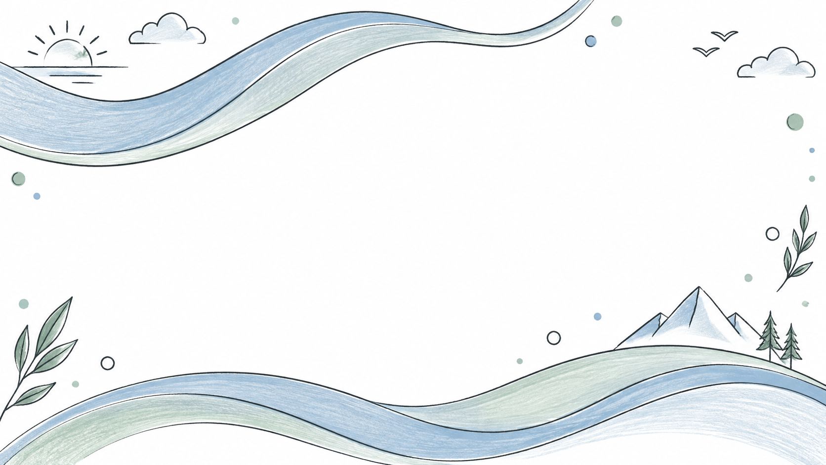
Wave animations stack two or three looping SVG curves along the bottom of a hero or between sections, drifting sideways at slightly different speeds. SaaS and agency pages use them as animated dividers, while travel and hospitality sites lean on them as a literal reference to water. Either way, the motion stays low and predictable, so your headline keeps the top of the section to itself.
Getting the layers right
Depth comes from offset, not quantity. Give the front layer the strongest opacity, fade the layers behind it, and keep the vertical movement small so the wave never climbs into body copy. Match fills to brand colors in CSS rather than exporting a new image for every palette change.
- Two layers on mobile: Drop the third layer on small screens to protect frame rate without losing the effect.
- Text above the crest: Set a safe zone where no wave edge reaches your headline or form.
- Slow drift over urgency: A long, calm loop reads as polish. A fast one reads as a warning banner.
For a billing tool launching a pricing page, a navy wave under white copy does the job. It adds movement, signals flow, and costs almost nothing to render because you're animating a path, not a canvas of particles.
Practical rule: If you can freeze the wave at any frame and the page still looks designed, the speed and placement are probably right.
Choose this when you want the safest animated option for a conversion page with a headline, subcopy, and a form, and your brand can plausibly talk about flow, ease, or momentum.
2. Bubble Animations
Say you're launching a sparkling drink, a bath product, or a kids' app. Floating circles that rise, wobble, and fade give you instant lightness without a product video. Most versions use a small particle system that randomizes size, speed, and opacity, so the field never looks like a repeating tile.
That randomness is also the risk. Bubbles wander into text, cluster behind a button, or multiply until a phone's GPU works harder than it should for decoration. Treat the particle count as a performance setting, not a style choice, and cap it lower on small screens.
Keeping bubbles in the background
Set opacity low, keep speeds slow, and pull every color from the existing palette through CSS variables. If the hero contains a signup form, put a solid or lightly tinted panel behind the fields. A visitor should never wait for a bubble to drift away before reading a label.
Wellness and beverage brands get the strongest brand fit here because the metaphor explains itself. A B2B security product using bubbles has a tone problem before it has a technical one. Playfulness only helps if the offer can carry it.
Choose this when your product is consumer facing, light in tone, and your hero copy is short. Skip it when the page needs dense proof, pricing detail, or a serious trust claim in the first screen.
3. Heart Animations
Hearts don't need decoding. A charity appeal, a community milestone, or a Valentine's campaign can use floating or gently pulsing hearts and the visitor understands the feeling before reading a word. Used outside those moments, the same shapes turn sentimental fast.
Use the campaign clock
Limit this effect to a defined campaign period and use one heart color from the brand palette. A slow pulse feels calm, a fast beat feels like a medical monitor, and dozens of rising hearts pull attention away from a donation amount or email field. Let a single motif repeat at low density instead.
Heart backgrounds also run continuously beside other content, which creates an accessibility obligation. The web.dev guidance on motion and accessibility notes that WCAG requires a mechanism to pause, stop, or hide automatically moving content that lasts more than five seconds and runs alongside other page content. Honor prefers-reduced-motion too, and replace the pulse with a still shape.
Consider a nonprofit thanking monthly donors. A faint heart rising behind a short headline supports the message, while the donation form sits on a solid card. The emotion stays, the transaction stays legible.
Choose this when love, care, gratitude, or community is the campaign theme and the page has a short shelf life. Don't make it your permanent homepage background.
4. Pattern Animations
Dots, grids, stripes, and chevrons give a page texture without pretending to be a picture. Developer tools use faint animated grids because they suggest structure and precision. E-commerce promotions use looping stripes because they add energy around a discount without needing a new photo shoot.
Patterns tile efficiently, which makes them cheap to scale across a wide hero. Cheap doesn't mean careless. Animate one property, ideally background position, transform, or opacity, and keep the pattern faint enough that copy wins at a glance.
The HTTP Archive 2025 performance almanac reports that non-composited animations appeared on 40% of mobile pages and 44% of desktop pages, and those effects can contribute to layout shift. Sticking to transform and opacity keeps your pattern off the layout path.
- Opacity in the 5 to 15 percent range: Content stays dominant while the surface stops looking empty.
- CSS custom properties for color: Switch themes or campaign colors without rebuilding the tile.
- No fast, high contrast stripes near text: They create visual vibration and make small copy hard to track.
Choose this when you need subtle texture for a technical, editorial, or promotional page with lots of text and you want an effect that survives scaling from phone to wide monitor.
5. 3D Backgrounds
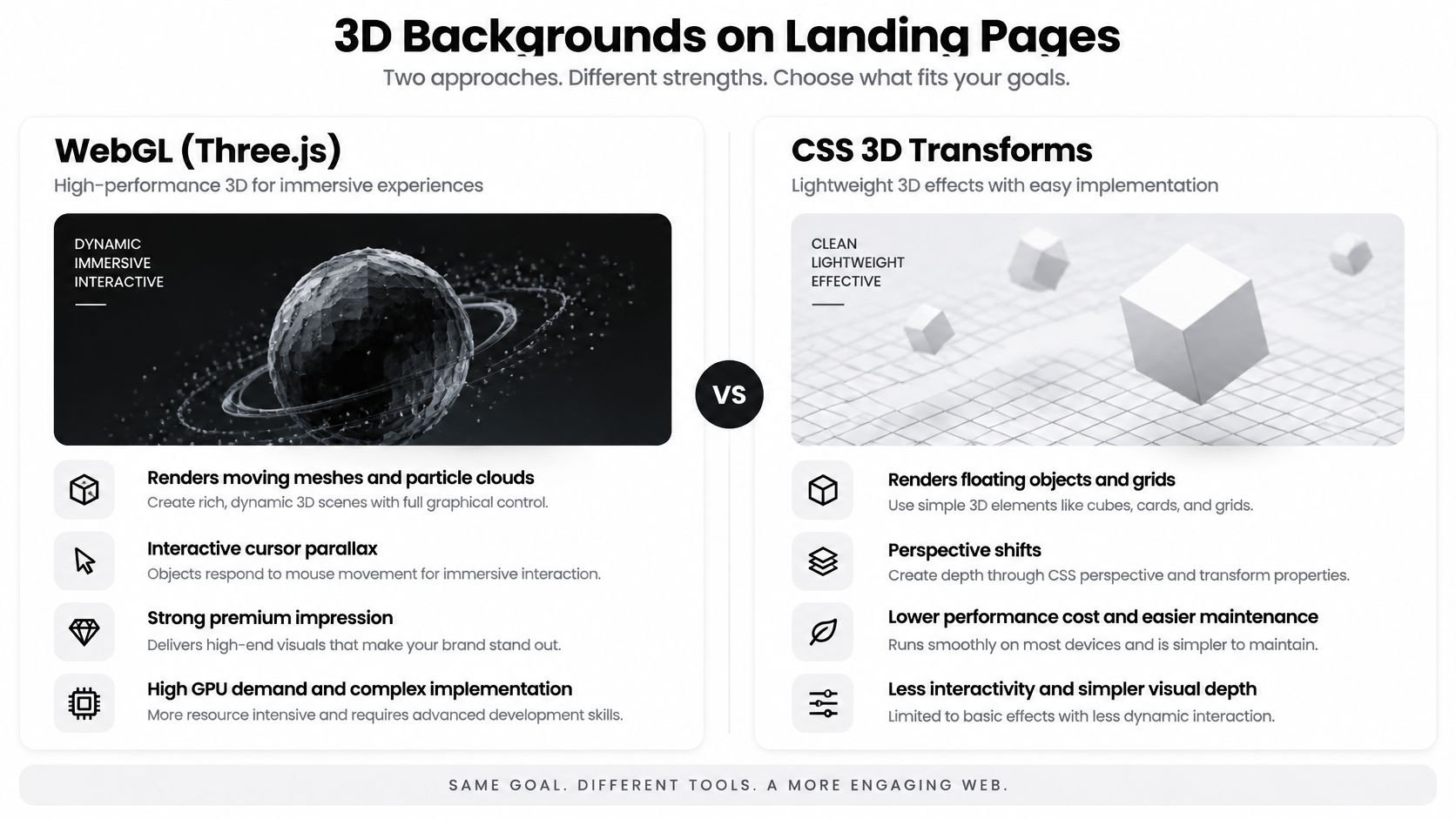
A rotating product form, a floating grid, or a softly lit sphere can make a technology page feel premium in seconds. You get that depth from WebGL, often through Three.js, or from CSS 3D transforms for simpler scenes. The trade-off is blunt. You're now running a small rendering program behind your headline.
Budget the render, not just the look
Lower render resolution and object count on mobile, pause the scene with IntersectionObserver when it scrolls off screen, and ship a static fallback image for devices that can't run WebGL well. Tint objects with brand colors and keep lighting neutral so the scene doesn't fight your button color.
Measure the result against hard thresholds. A guide to animated pages and Core Web Vitals lists good field targets as Largest Contentful Paint of 2.5 seconds or less, Interaction to Next Paint of 200 milliseconds or less, and Cumulative Layout Shift of 0.1 or less. If the scene delays the headline, it fails, however good it looks.
For phone specific tactics, see these mobile friendly animated background techniques before committing to a full WebGL build.
Choose this when depth itself supports the pitch, such as a 3D product, design tool, or spatial platform, and you can test on real mid-range phones. Skip it for a simple lead form.
6. Tunnel Backgrounds
Tunnel effects send rings or lines toward a central vanishing point, so the visitor feels pulled forward. Game launches use the warp speed version. Conferences use a slower corridor to build anticipation around a date and a registration button.
That central pull is useful only if you aim it. Put the vanishing point behind a logo, a short headline, or empty space. Put it behind three lines of explanatory copy and you've built a reading obstacle course.
A tunnel should point at one thing. If it points at everything in the hero, it points at nothing.
Speed is an accessibility decision
Use a slow, steady pace without sudden acceleration, reduce ring count on mobile, and offer a static version. The W3C Web Content Accessibility Guidelines 2.1 state that content must not flash more than 3 times in any 1-second period unless it stays below specified flash thresholds. High contrast rings strobing past text can get you into trouble quickly, and forward motion is a known trigger for vestibular discomfort.
An esports tournament page can carry a tunnel because speed and immersion are the product. A health service or financial signup page can't, because the sensation undermines calm and trust.
Choose this when the page sells an event, game, or launch moment, the hero copy is very short, and you can provide a still alternative without losing the message.
7. Fluid Simulations
Move your cursor and color swirls like ink in water. That's the appeal of a WebGL fluid simulation, and creative agencies, musicians, and art projects use it because the background itself demonstrates craft. It's also the easiest effect on this list to overdo.
The simulation computes velocity and dye fields on the GPU, so resolution drives cost. Lower the simulation resolution on mobile, confine the effect to the hero, and tune dissipation so trails fade before they pool behind your copy. On touch devices, disable cursor style interaction where it fights scrolling, because visitors who can't scroll past your artwork won't admire it.
This example shows the organic movement visitors expect from the technique.
Content fit is the deciding test. Fluid color changes constantly, so a paragraph that's readable on a dark patch may vanish on a bright one seconds later. Put text on a controlled panel or darken the whole field, then check contrast across the full cycle, not on your favorite frame.
Choose this when the page is a portfolio, album, exhibition, or brand statement and interaction is part of the pitch. Don't choose it when the first screen must explain pricing, compliance, or a multi-step offer.
8. Noise Animations
Noise animations use procedural functions such as Perlin or simplex noise to shift color slowly, producing a gradient mesh that never repeats in an obvious loop. Modern SaaS and fintech pages use them for a simple reason. They look current, they stay calm, and they don't ask the visitor to interpret a shape.
Restrict the palette to two or three brand colors and slow the cycle until you almost question whether it's moving. A subtle grain overlay adds texture without adding motion, which helps large color fields avoid looking like flat plastic. Because the colors travel, test headline, subcopy, input labels, and focus states at several points in the cycle.
Contrast check: Scrub the animation to its brightest and darkest frames. If either one breaks your text, the palette range is too wide.
A fintech waitlist page is a strong use case. You get a premium, shifting field behind one headline and one email field, without the rendering weight of a full 3D scene or the literal imagery of waves and bubbles. The brand colors do the recognition work.
Choose this when you want modern movement with minimal metaphor, your copy is concise, and you can keep the color range tight enough for reliable contrast.
How the 8 Animated Background Styles Compare
| Item | Typical Build Method | Best For | Main Drawback |
|---|---|---|---|
| Wave Animations | Layered SVG paths or CSS-animated gradients | Hero sections, section dividers, and brand-focused landing pages | Can look generic or affect performance with many layers |
| Bubble Animations | CSS keyframes or JavaScript particle systems | Consumer product pages, creative brands, and playful campaigns | Many particles can drain battery and distract from content |
| Heart Animations | SVG or CSS shapes with pulse or float animations | Seasonal, charity, romantic, or celebratory pages | Limited versatility and can feel out of place |
| Pattern Animations | CSS gradients or SVG patterns with shifting or transforming motifs | Developer tools, documentation, and structured B2B pages | High contrast or dense patterns can reduce readability |
| 3D Backgrounds | WebGL libraries such as Three.js or CSS 3D transforms | Technology products, premium brand pages, and interactive presentations | High resource demands and implementation complexity |
| Tunnel Backgrounds | WebGL, canvas, or CSS perspective effects | Product launches, events, and gaming or entertainment sites | Strong motion can cause discomfort or disorientation |
| Fluid Simulations | GPU-based WebGL shaders simulating fluid dynamics | Creative agencies, art and music sites, and interactive brand experiences | Computationally heavy and potentially distracting |
| Noise Animations | Procedural noise using CSS, canvas, or WebGL shaders | SaaS, fintech, design studios, and modern brand sites | Can be subtle, and shader versions may tax older devices |
Matching Motion to Your Brand, Content, and Mobile Visitors
Start by naming the job. A background can signal flow, energy, care, precision, depth, speed, craft, or calm, but it can't signal all of them. Pick the style whose built-in metaphor matches the offer, then remove every layer, particle, and color that doesn't support that signal.
Next, test content fit with real copy at real sizes. Read the headline, subcopy, form labels, error states, and button text while the animation runs through a full cycle. Check keyboard focus indicators too, because a bright moving field can swallow a thin outline. If you need a solid panel behind the form, that's not a design failure. That's the background admitting where its job ends.
Then test on a phone you didn't develop on. Throttle the CPU, scroll, tap the call to action, and watch whether the effect stutters, delays the headline, or keeps rendering after it leaves the screen. Cut particle counts, simulation resolution, and animated layers before you cut copy. Your visitor came for the offer, not the render.
Build the reduced-motion version as a real design, not an apology. Guidance summarized by Landerkit on landing page animation and conversion recommends testing animated and static versions using conversion rate, scroll depth, and time to first click rather than assuming motion helps. Keep the same palette, hierarchy, and focal point, and replace travel or pulsing with a still gradient or a soft, infrequent opacity change.
Use this checklist before you publish:
- Brand palette locked: The effect uses your colors, not the demo colors it shipped with.
- Contrast proven across the cycle: Text and controls pass at the brightest, darkest, and busiest frames.
- Mobile budget enforced: Layers, particles, and render resolution drop on small screens, and off-screen effects pause.
- Reduced-motion fallback designed: The page keeps its hierarchy and call to action with motion reduced or stopped.
- Static version measured: You compare click timing and conversion instead of trusting taste.
If you're unsure where to start, start cheap. Prototype a CSS wave or a slow noise gradient, put it behind your actual headline, and test it on a real phone this week. Move to 3D, tunnel, or fluid effects only when the simpler version fails a specific brand or campaign requirement.
Animated Backgrounds offers HTML and CSS background code across wave, bubble, heart, pattern, 3D, tunnel, fluid simulation, and noise categories, with adjustable colors and styles and a mobile-optimized library. That makes side by side prototyping easier than building eight effects from scratch. Pick one style that fits your page's goal, build the prototype, and measure it.
Browse the wave, bubble, pattern, noise, and other categories, adjust the colors to your brand, and add the HTML and CSS to a test hero before you commit to a heavier build. Visit Animated Backgrounds to compare mobile-optimized options in one place and prototype your shortlist this week.